EUNICE KIM | Product Designer

Loading...
Perceived Performance
Overview
ListenFirst is a comprehensive data driven social analytic platform. It's a powerful platform with big data applications and we try to ensure its great performance from a design and technical perspective.
But no matter how hard we try to optimize the system to minimize the delay and provide users with a well-designed product, there will always be a point where the user has to wait. Understanding the expectations of our users and providing a great experience in that waiting time can make a huge difference to users and gain retention rates.
Role
UX Designer | Idea Generation, UX Research, Information Architecture, Wireframes, Prototypes, QA for engineers
Timeline
4 months, January 2022 - April 2022
Goal
Introduce improvements to loading behavior throughout the platform to reduce user frustration, including content placeholder loading and progressive loading of analysis tiles.
Tools
Sketch, Photoshop
01 / The Problem
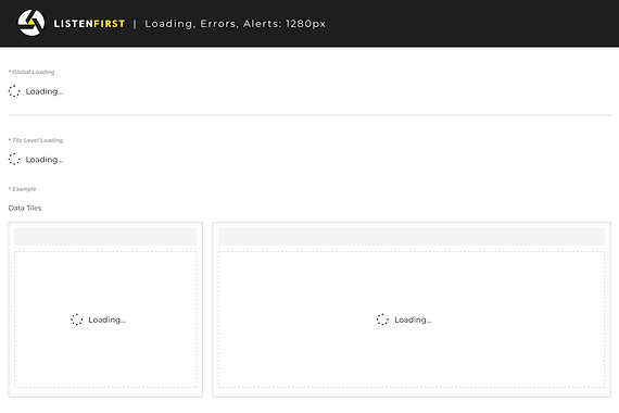
Current use of loader / spinner throughout the ListenFirst platform creates a period of uncertainty for the user since the load time is unknown. It draws attention to the fact that the user is waiting. There is a sudden transition of the screen which makes the user confused and raises different questions in their mind.
1. How much time will the data take to load?
2. What will I get to see in the first place?
3. How much content has been loaded and how much still remains?
It only takes 3 seconds for the user to abandon a product.
A study shows that 47% of users expect a webpage or an app to load in 2 seconds or less. After 4 seconds, the average user starts getting frustrated and after 8 seconds, they leave. In fact, a one second delay in the site speed can result in a 7% reduction in customer conversions. Loading time is crucial to the success of the site, app or program and if we can keep the user engaged for those few seconds / milliseconds, even better.
02 / Research

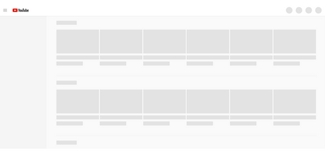
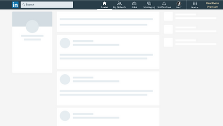
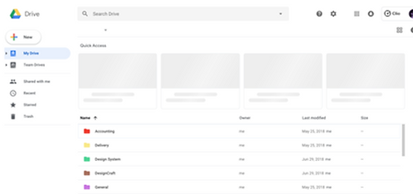
Give users a sneak peek!
To give the impression that content is loading quickly, Facebook, LinkedIn, YouTube and among others uses skeleton screens.
All of these examples above employ common visual design approaches:
-
Use of motion within the skeleton objects
-
Skeleton objects are light grey or neutral in color
-
Facebook, LinkedIn, and YouTube seem to be using skeleton as splash screens, whereas Google Drive uses a spinner for landing its primary folder structure, and skeleton objects for the quick access slots.
Benefits of using skeleton screens
-
Skeleton screen when used as the feature in the product make people perceive that app/website is loading fast. Improved perceived performance not only providing good UX but also helps in increasing conversion ratio.
-
By designing the skeleton screen that leverage motion helps in decreasing the perceived duration time.
-
Further using skeleton screen with progressive loading is thought of benefit for the user. In progressive loading individual element becomes visible as soon as it is loaded, it helps in displaying the content that is exactly loaded and what is yet to be loaded. Using these features all together act as a clear indication of progress.
03 / Wireframes
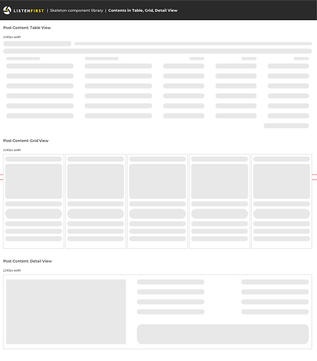
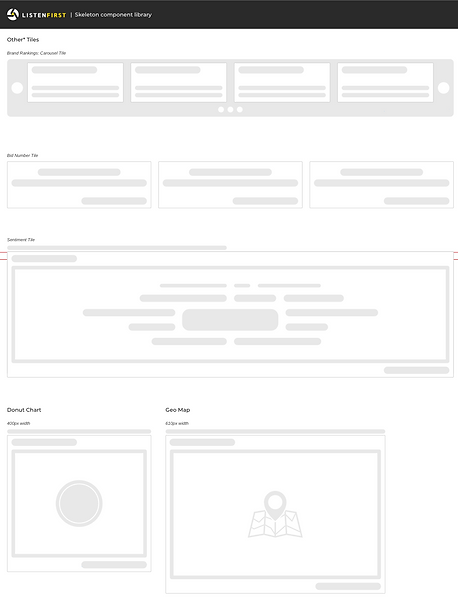
ListenFirst social analytic platform consists of many data visualizations and components which needed to be standardized for load state visual consistency.
Skeleton Component Library


Stress Test & Prioritize the loading content
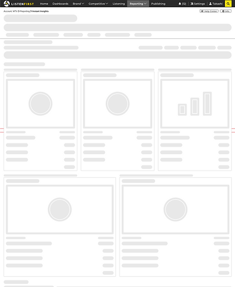
In order to improve upon performance and perceived performance, we needed to ensure that the page renders the load states from top to bottom. We also decided to have the top navigation always display to ensure information architecture was established. Having the top navigation, breadcrumb, help center and info buttons to display at all times will keep users inform of where they are within the platform and indicate something is happening in the background while they wait.

04 / Motion Design
Inform and Entertain!
Waiting is one of the most annoying things we all experience daily, both online and offline. Any factor making it not that boring is precious. Since ListenFirst platform consists of heavy data visualizations with multiple colors to represent each social media, it was important to keep the motions subtle and elegant to reduce jumpiness and to create the experience of a progressive load occurs in stages.
Option 1

Option 2
Option 3

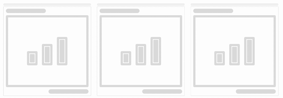
After a couple of iterations, the team decided to go forward with Option 3 as it was very subtle yet had elements allowing to display individual tiles that are ready first without having them jump around the screen.
05 / Final Design
New and improved load states were rolled out incrementally throughout the platform, started with the complete tabs and individual tile elements. This transformed the look of the navigation elements, analysis tiles, and content during load time. We also worked to improve load time and overall performance alongside with this perceived load state project.
*Showing only 2 tabs from the platform out of 23 tabs with multiple configurations.


06 / Conclusion
Delving into how humans perceive time in the context of the pace of technology around us, has been an enlightening experience!
In a perfect world, we would never need to show a loading state. But with platforms like ListenFirst with big data application, we fallback to the best possible loading state to provide better user experience in that waiting time. This project has helped our team to develop best practices to apply to our platform. It also helped us refine a performance mindset that encourages exploration.
Within a week of launching the new improved perceived load states, our user complaints dropped significantly and improved NPS scores from our users.